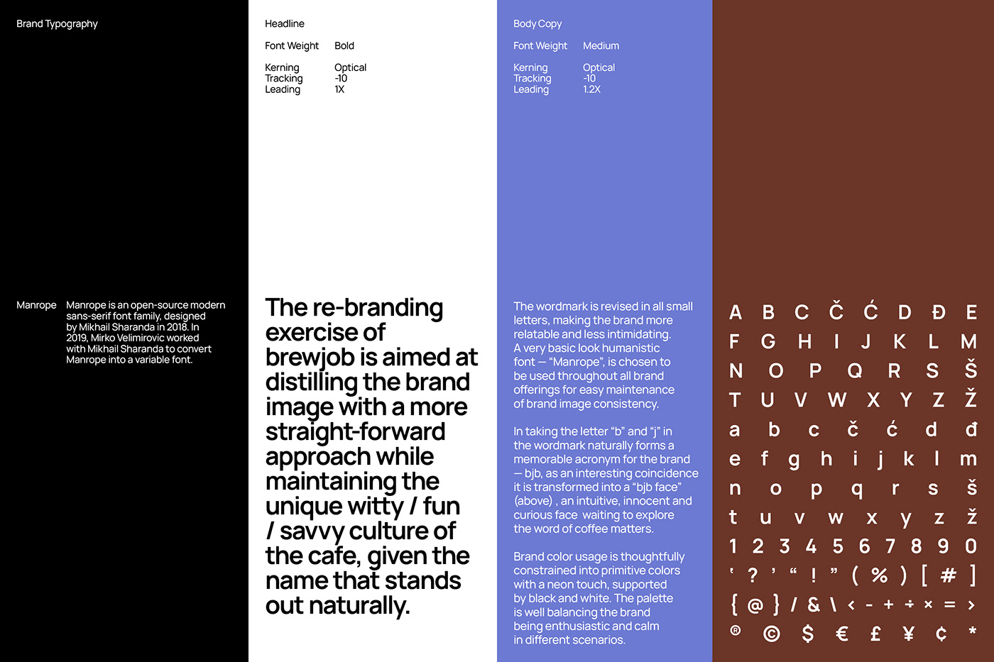
The re-branding exercise of brewjob is aimed at distilling the brand image with a more straight-forward approach while maintaining the unique witty / fun / savvy culture of the cafe, given the name that stands out naturally.
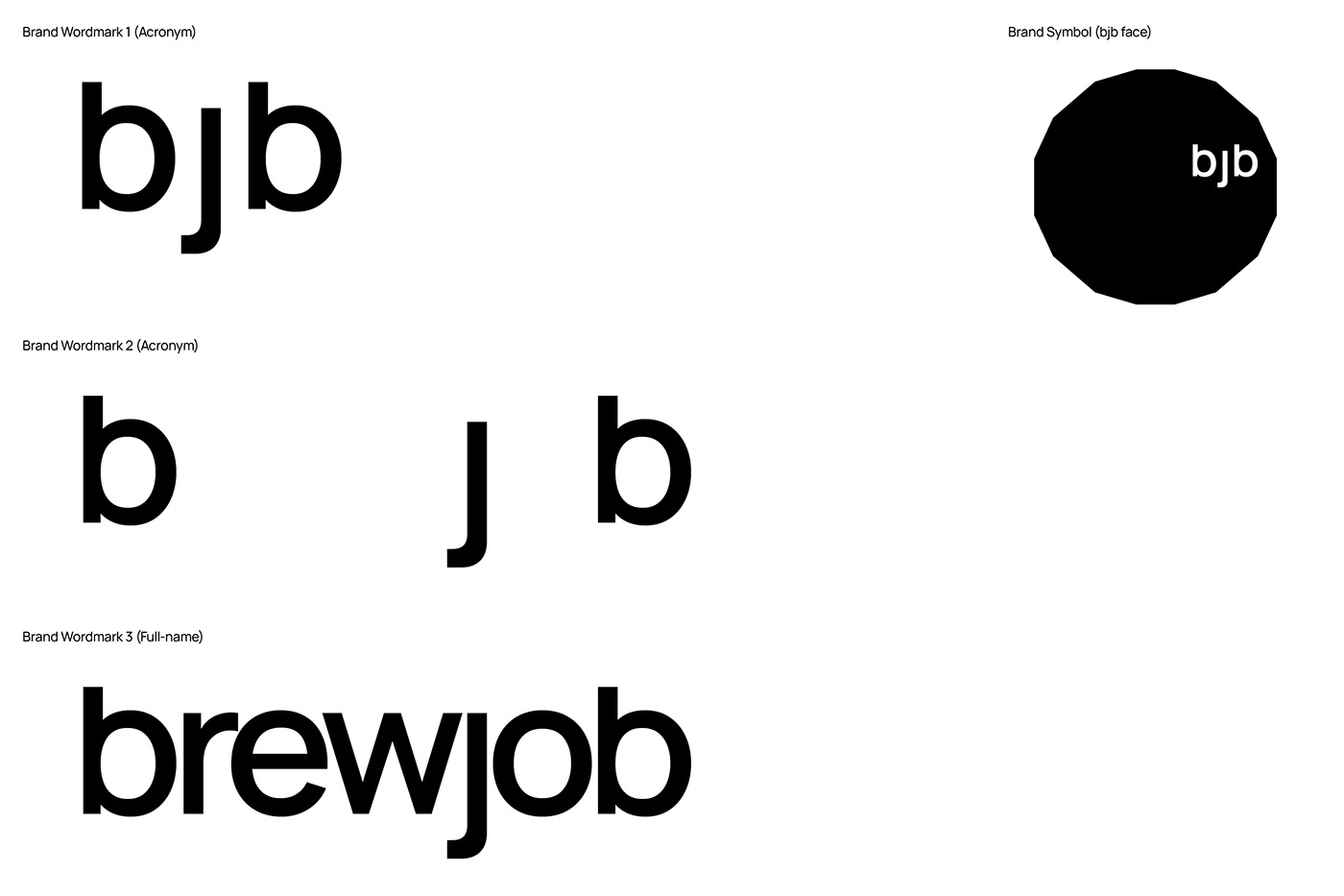
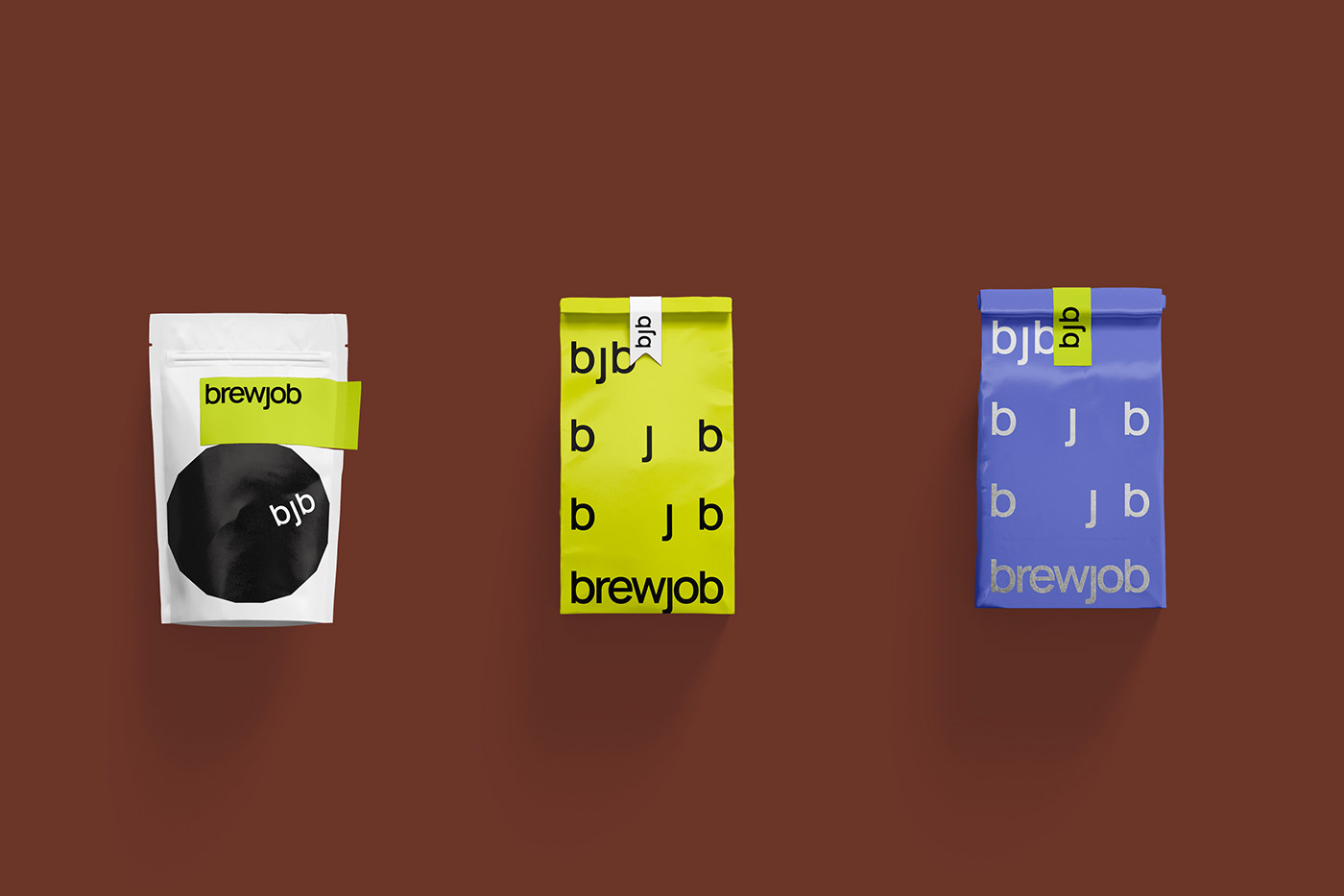
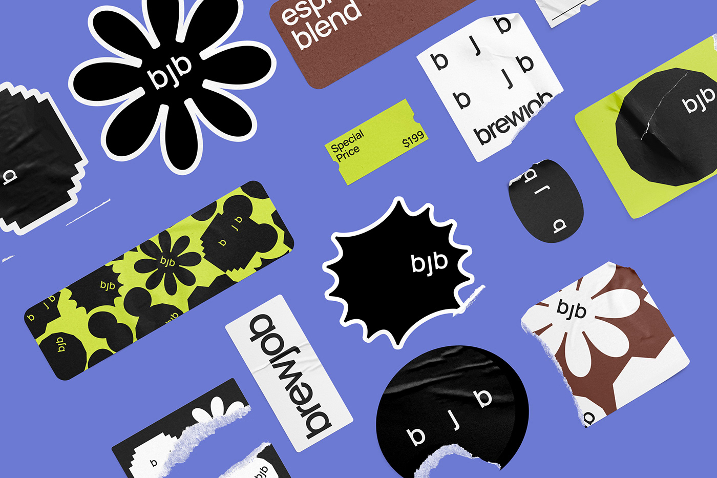
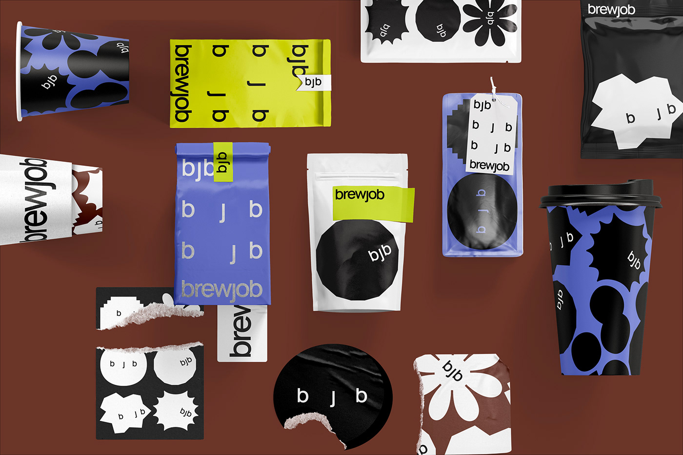
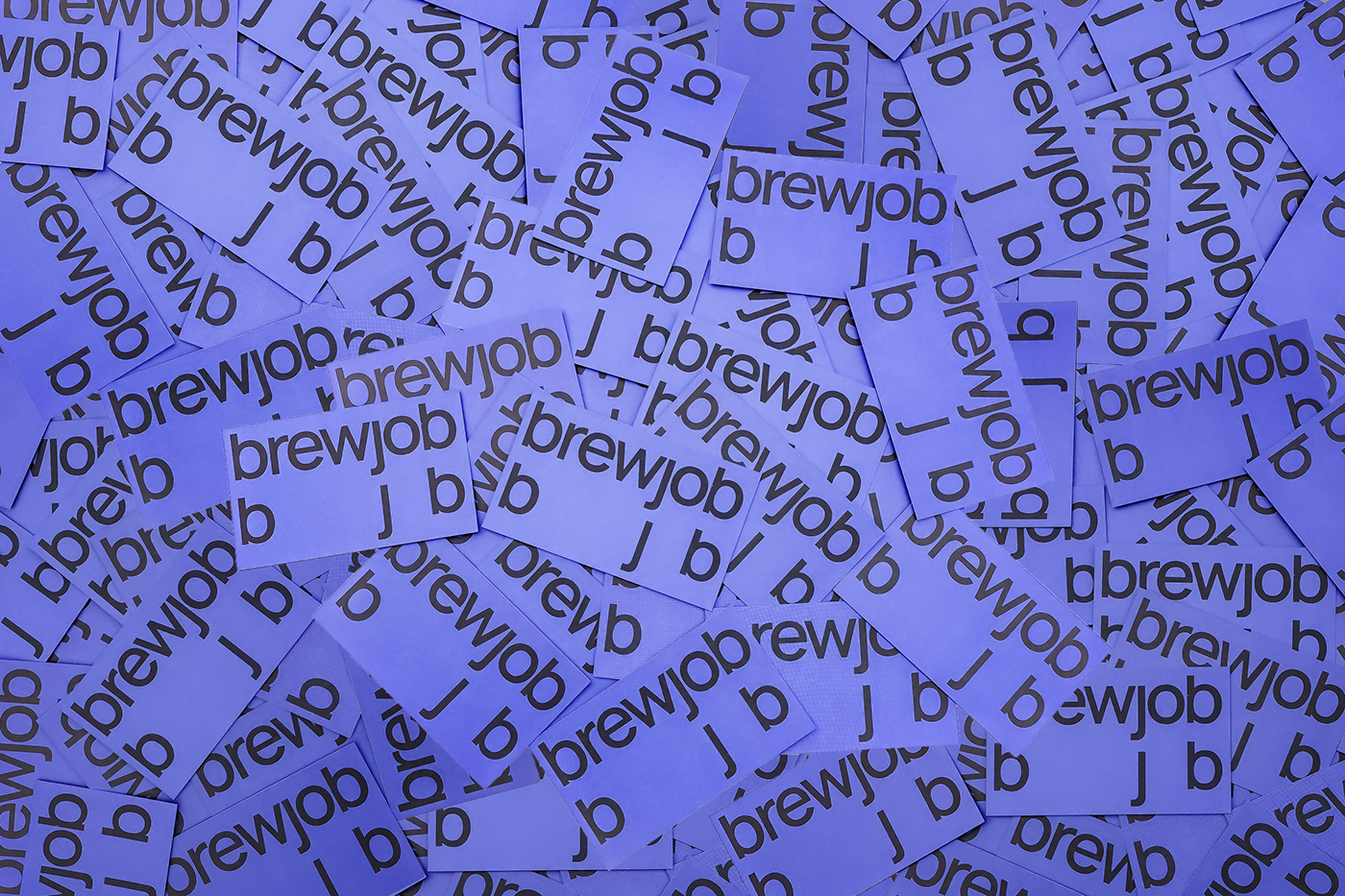
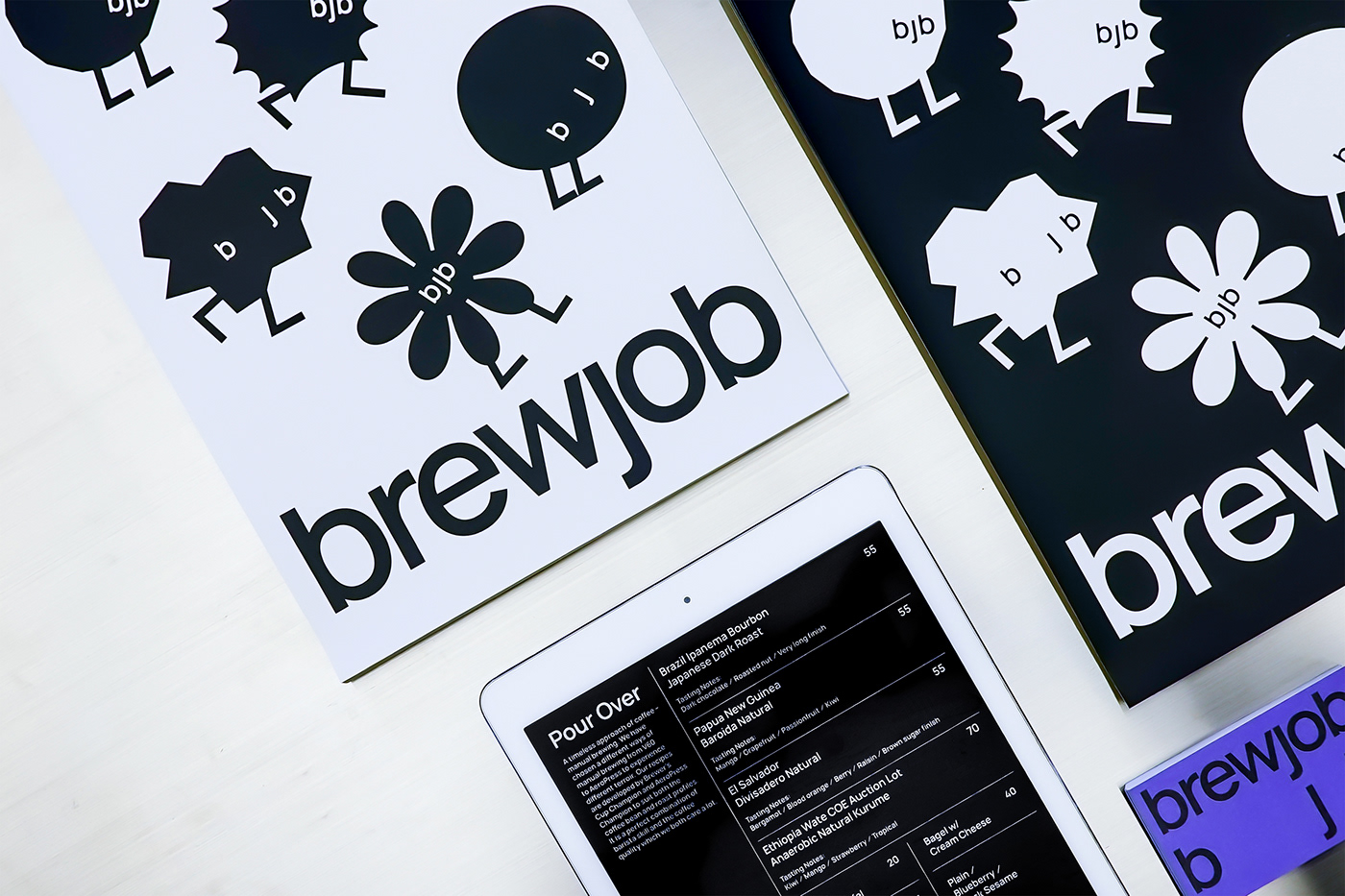
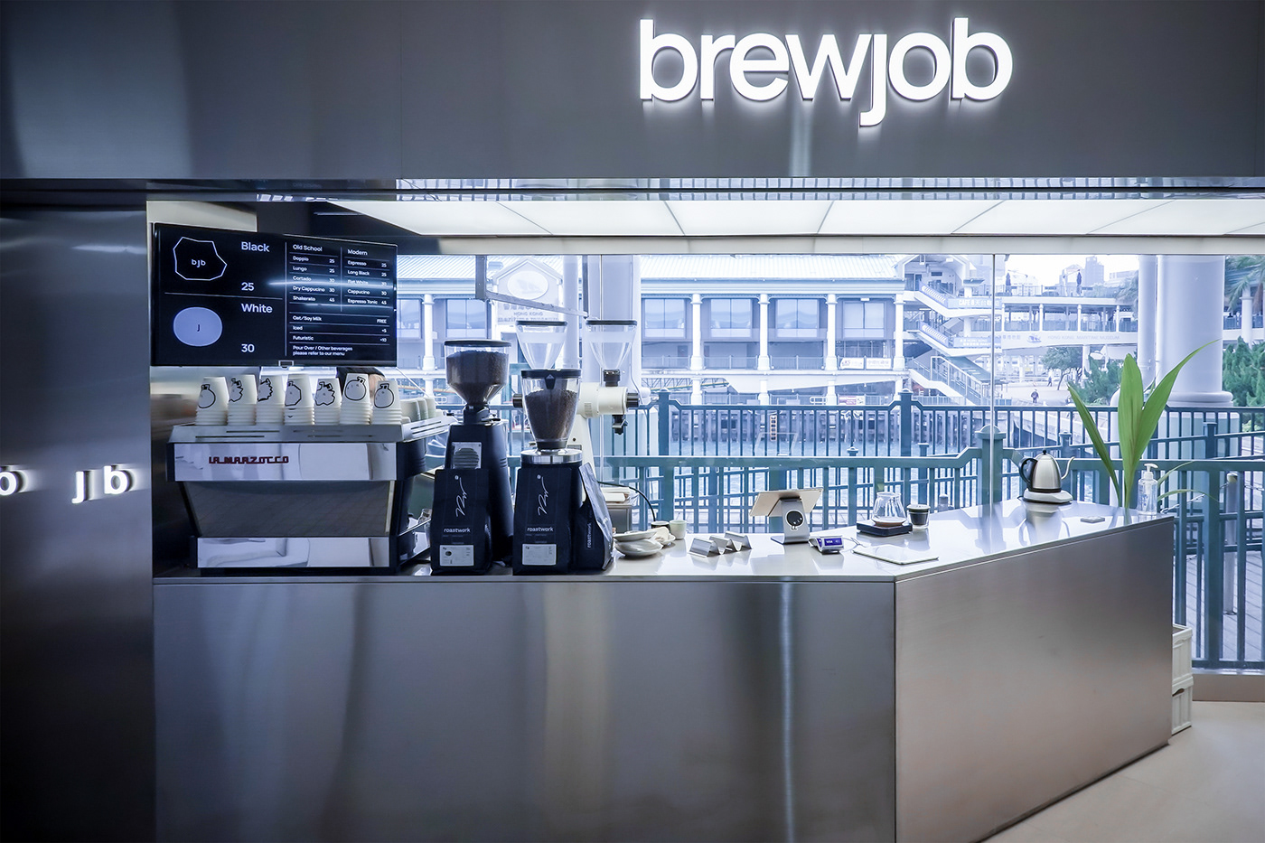
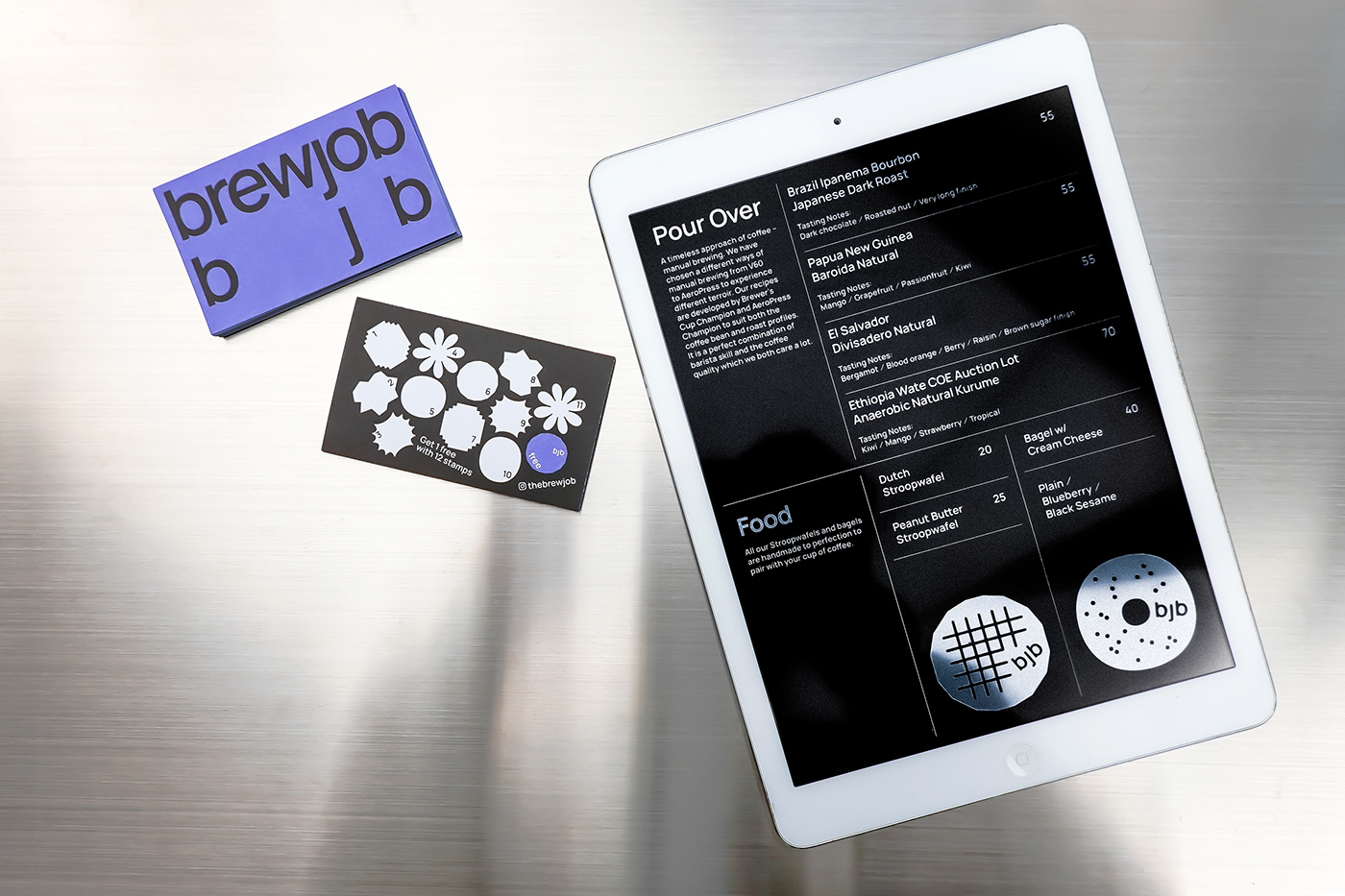
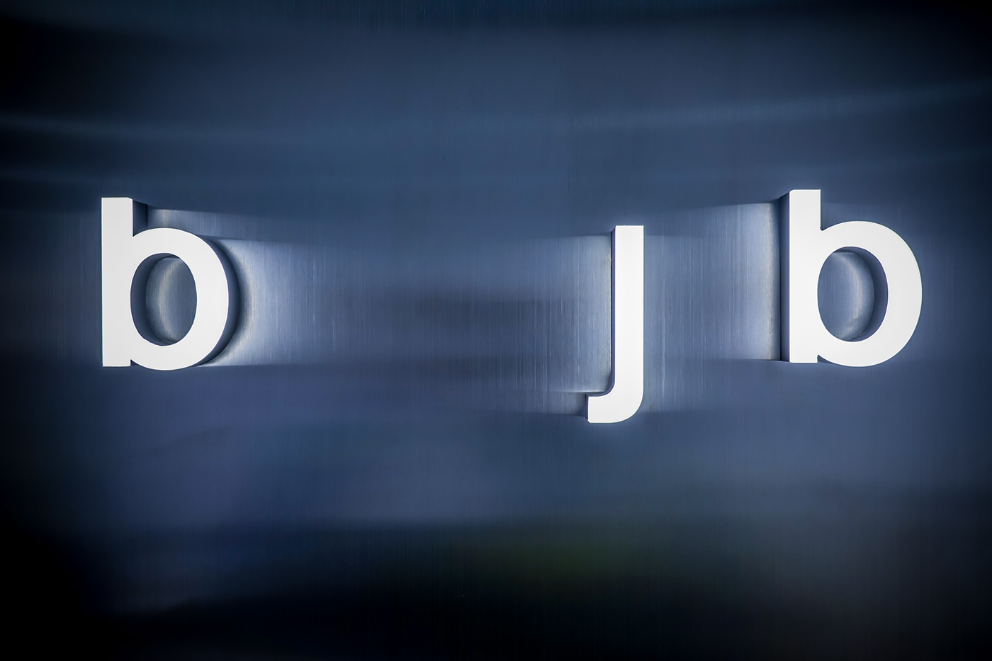
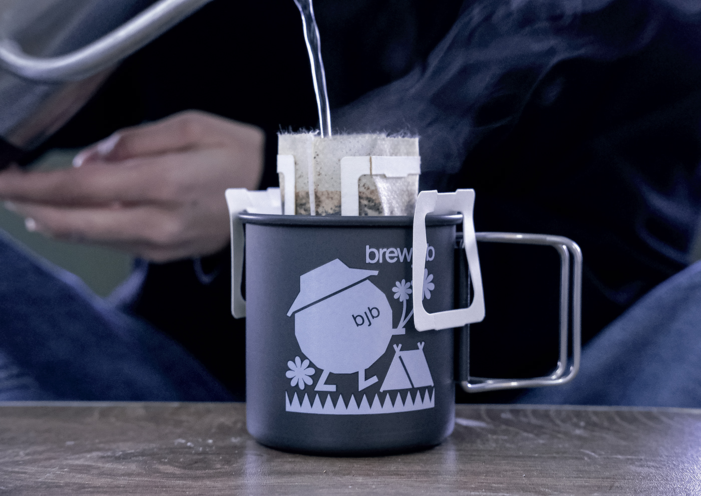
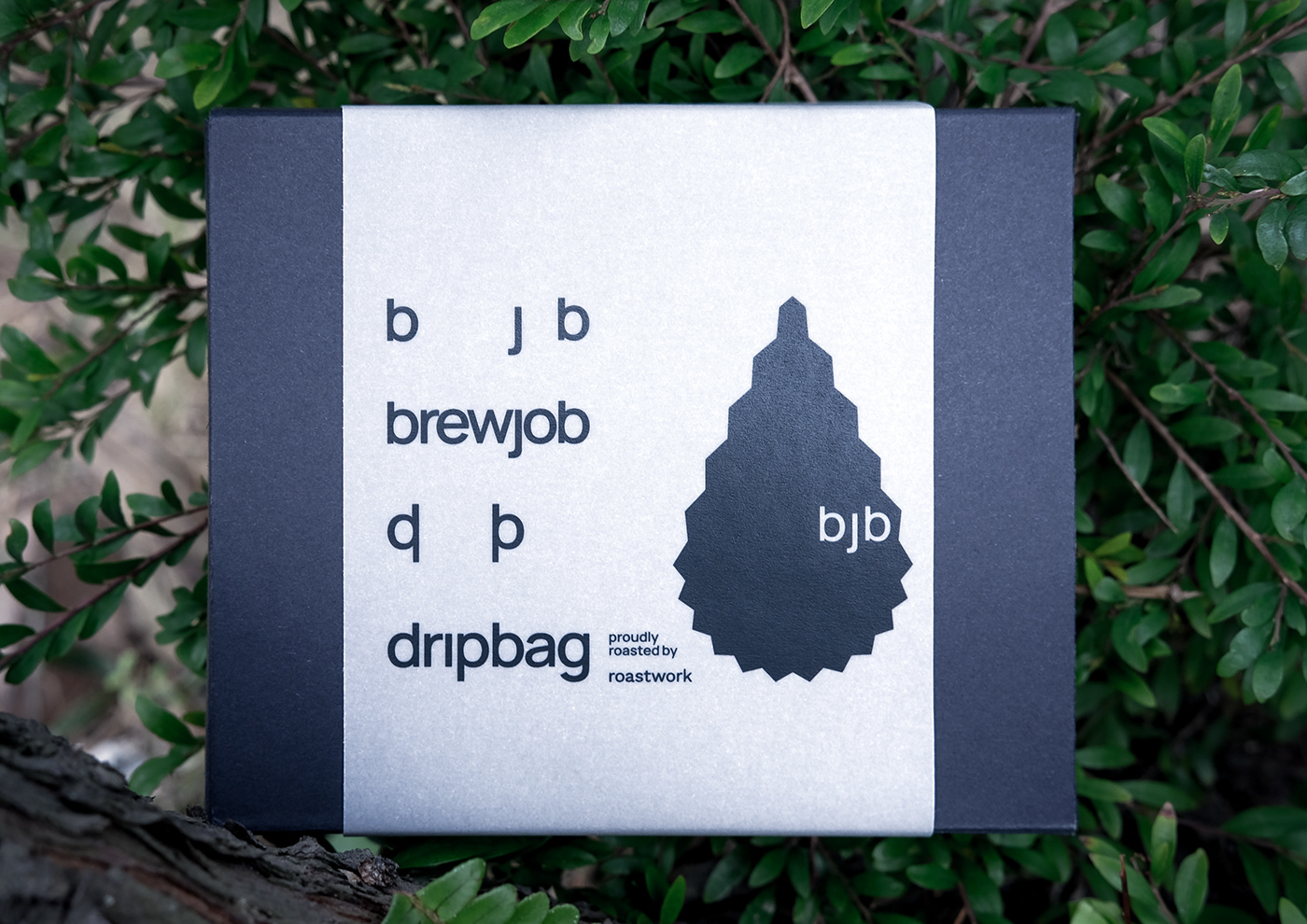
The wordmark is revised in all small letters, making the brand more relatable and less intimidating. A very basic look humanistic font — “Manrope”, is chosen to be used throughout all brand offerings for easy maintenance of brand image consistency.
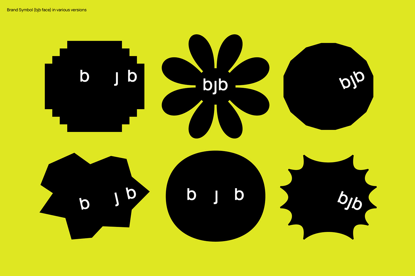
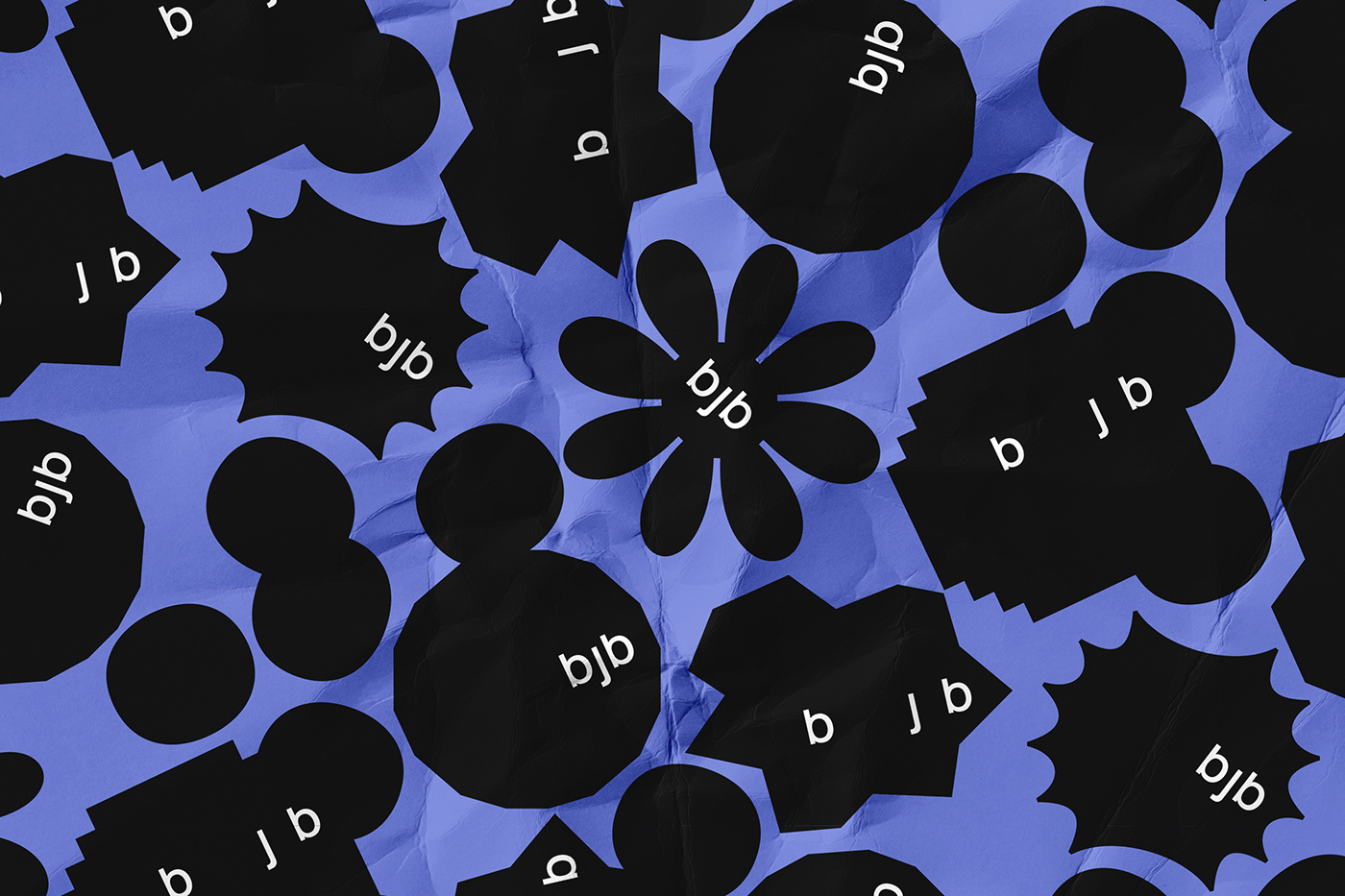
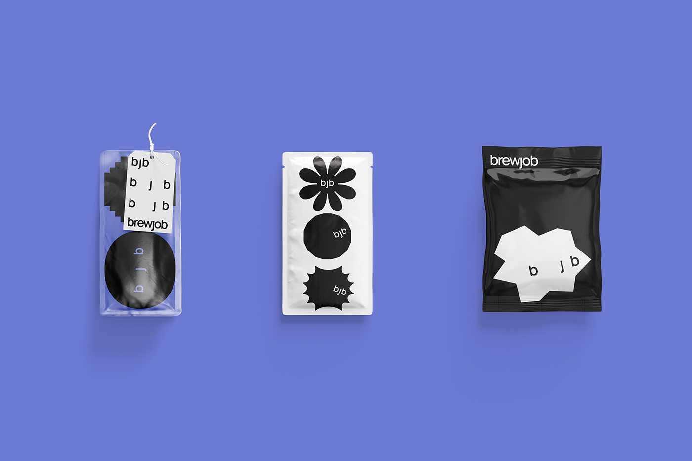
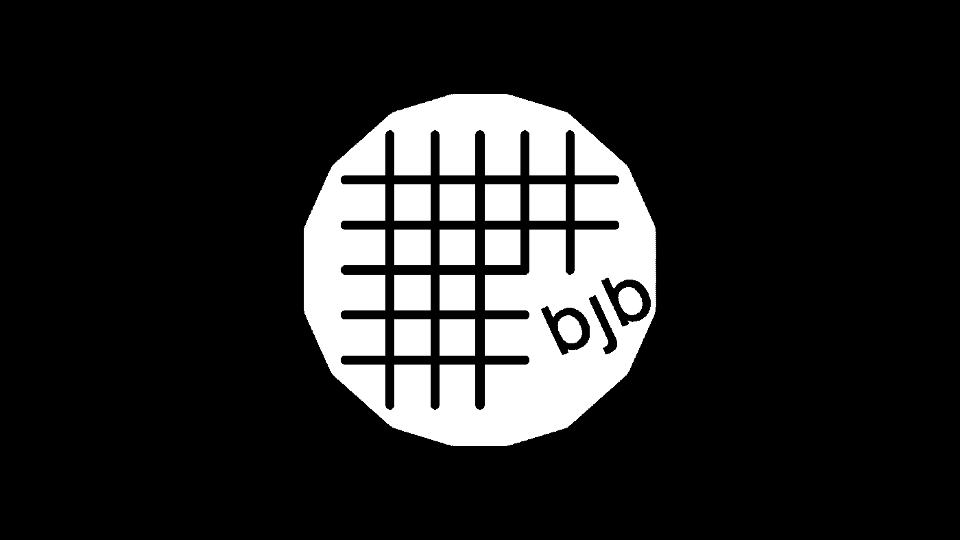
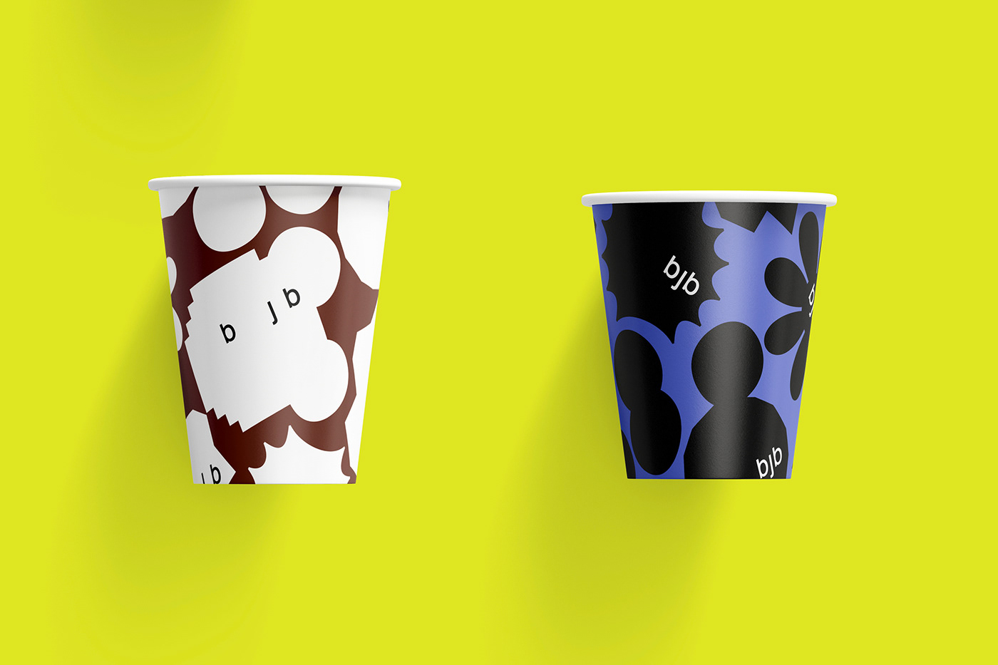
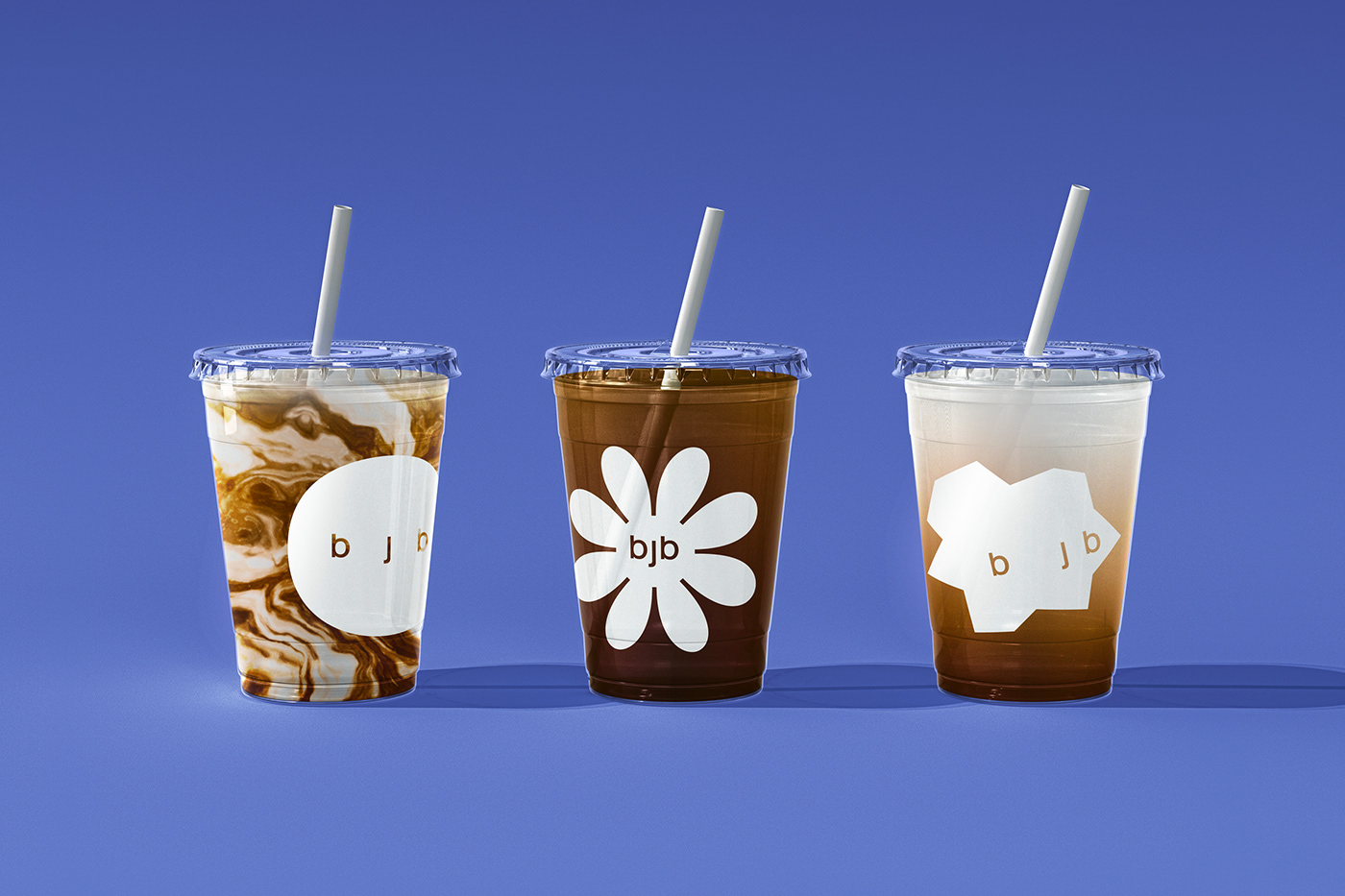
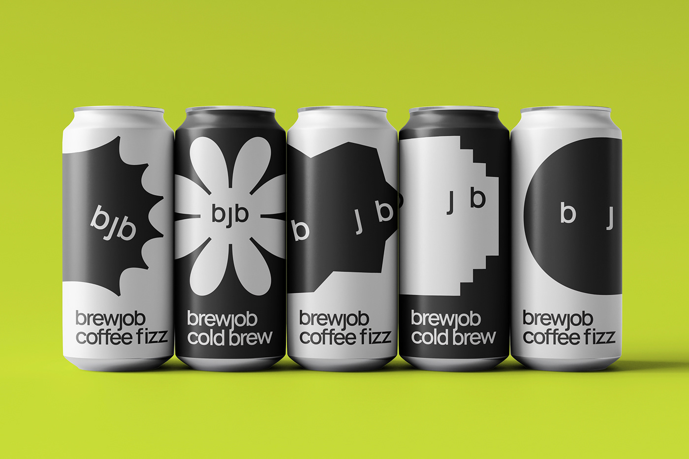
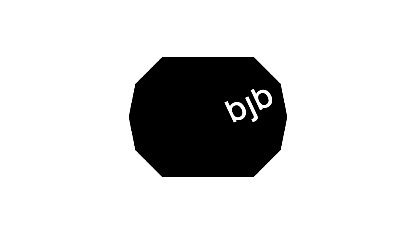
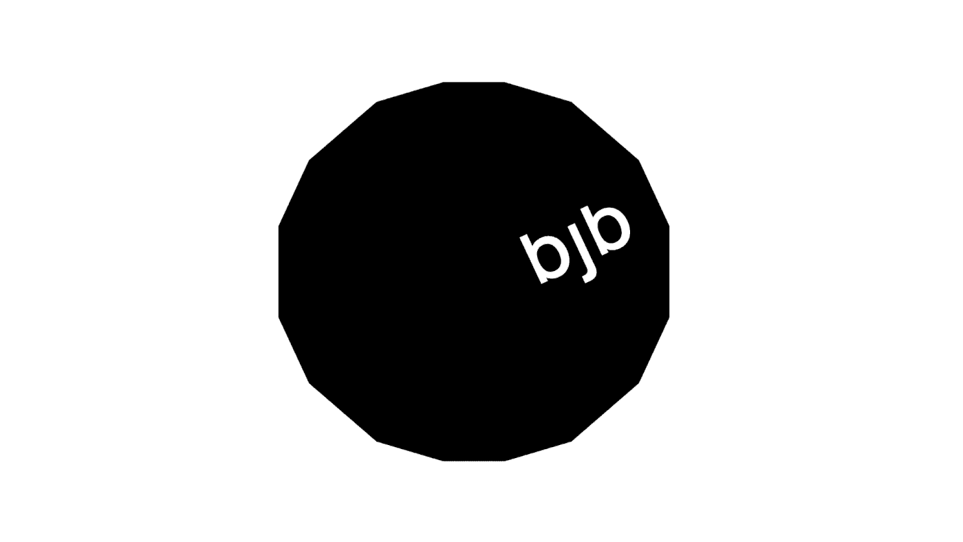
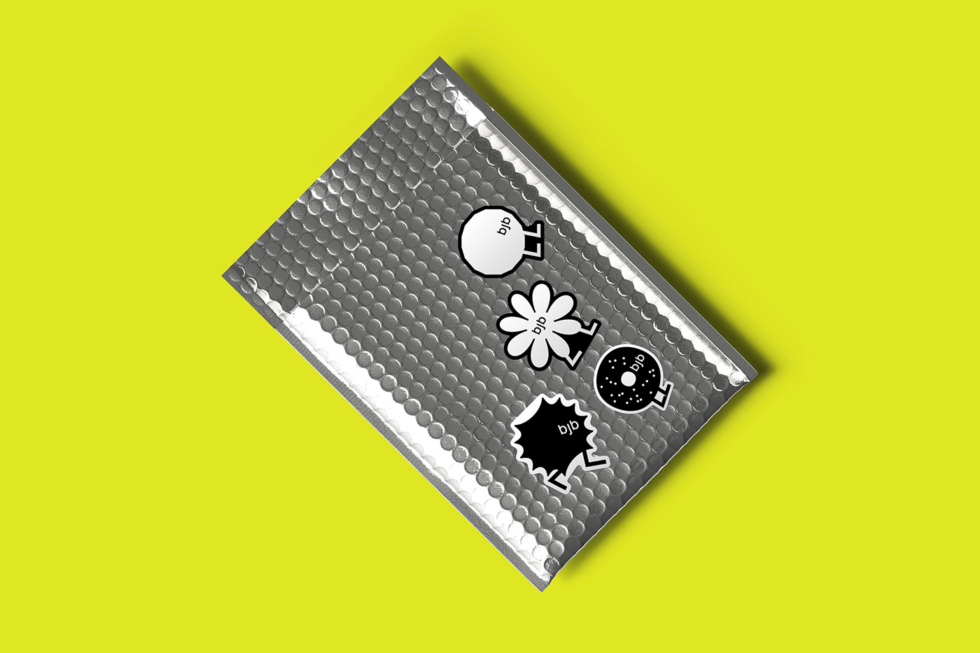
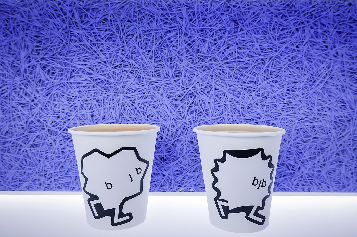
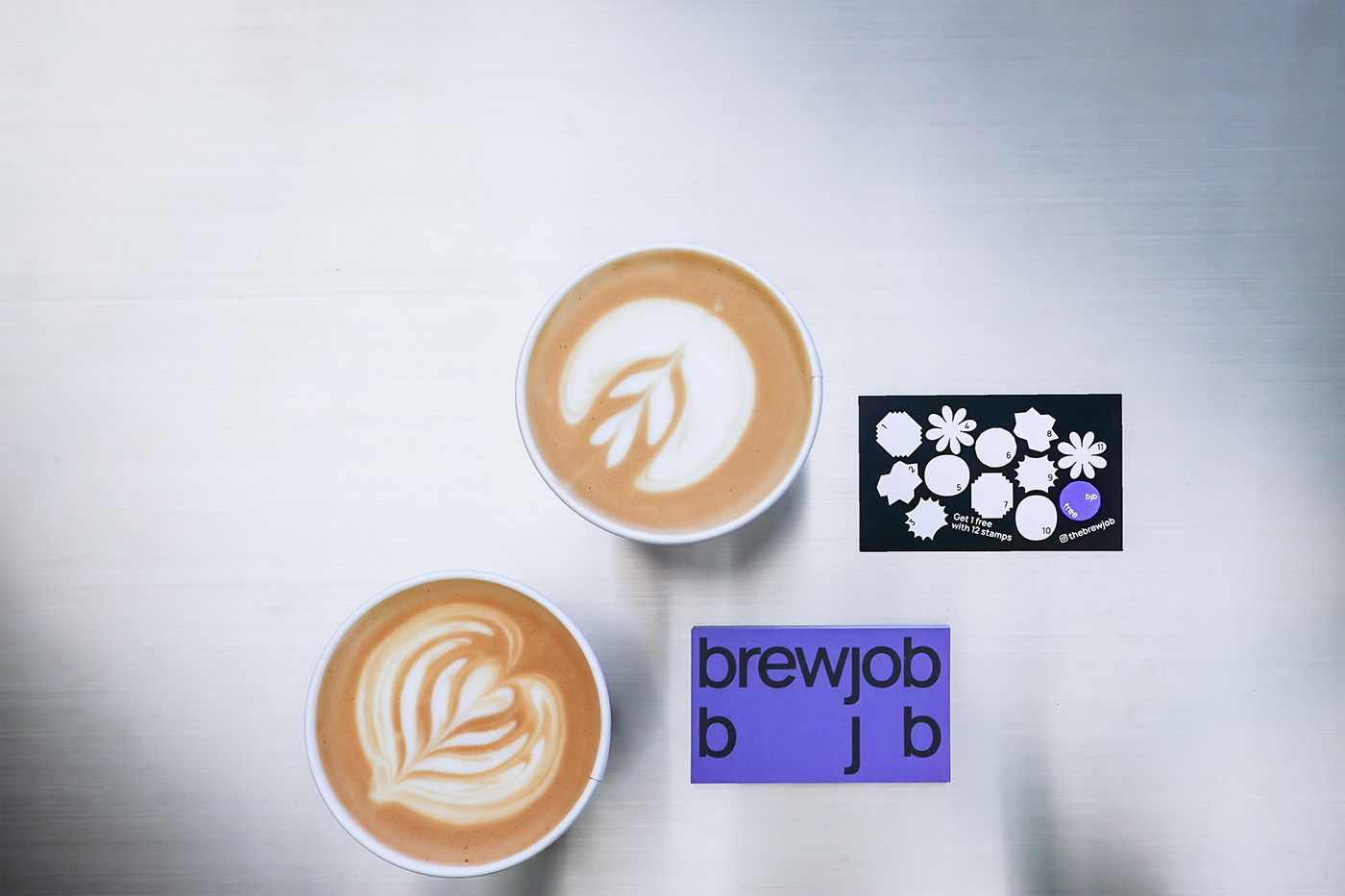
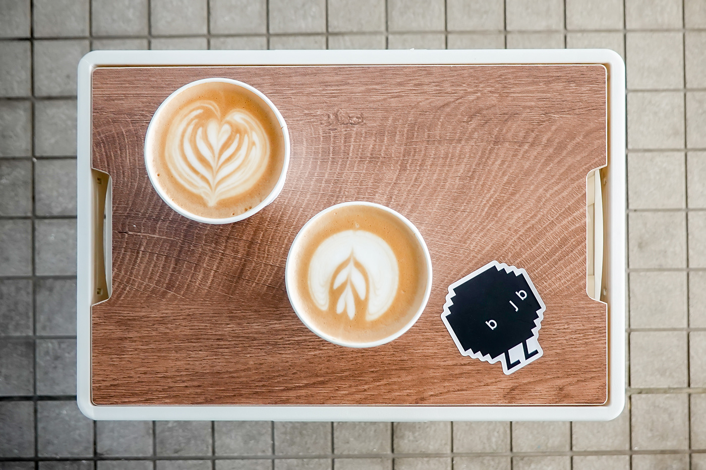
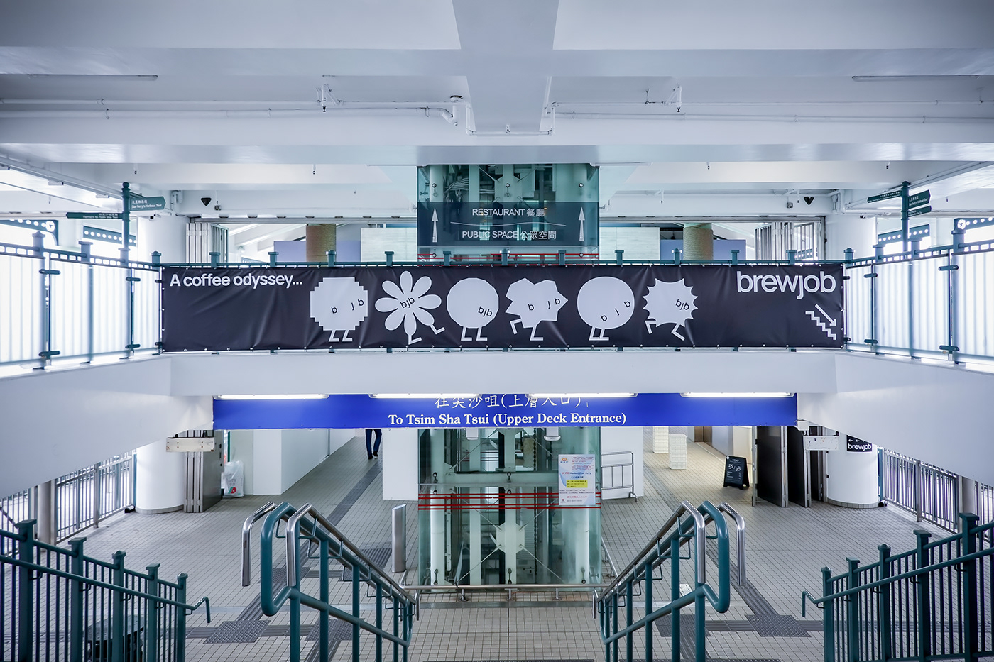
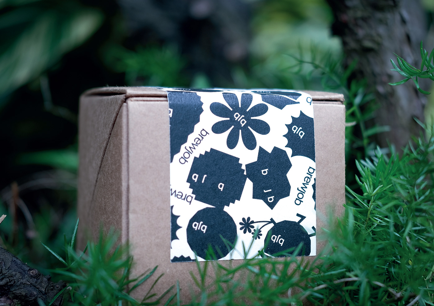
In taking the letter “b” and “j” in the wordmark naturally forms a memorable acronym for the brand — bjb, as an interesting coincidence it is transformed into a “bjb face”, an intuitive, innocent and curious face waiting to explore the word of coffee matters.
Brand color usage is thoughtfully constrained into primitive colors with a neon touch, supported by black and white. The palette is well balancing the brand being enthusiastic and calm in different scenarios.